Noggin Lobby
+ Parent Dashboard
Noggin↗ (Paramount) wanted to redesign the kids app lobby and parent dashboard experience to better showcase its educational (non-video streaming) content.
This redesign led to 22% increase in subscription retention after sign up.
Problem Space
How do parents feel about screen time on Noggin?
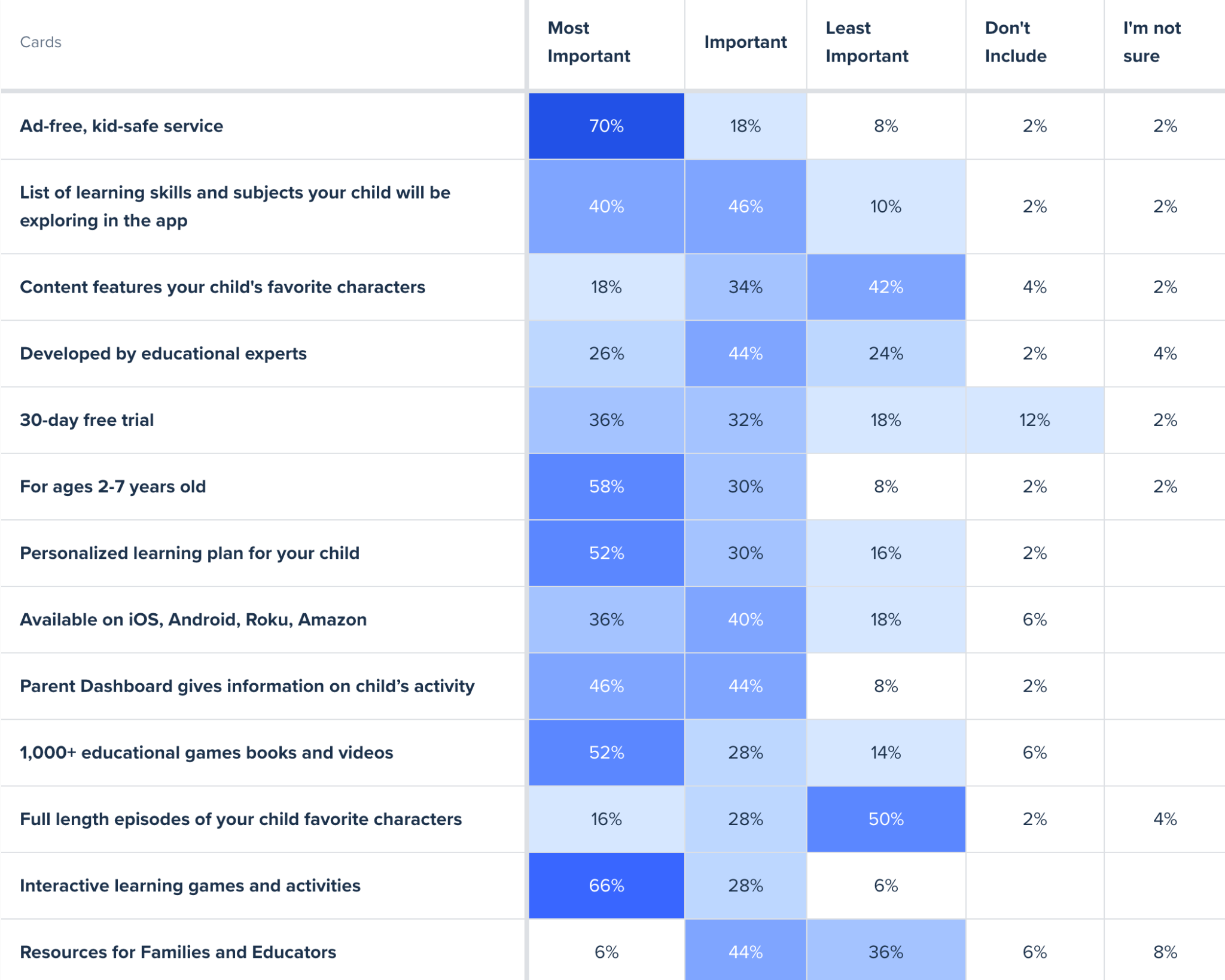
Card sorting activity for Value Prop of Noggin on Homepage
Based on an emailed survey to Noggin subscribers (parents), over ⅓ of 218 respondents view Noggin solely as a video streaming app, when the app actually offers much more educational interactive content, such as learning games and ebooks. Through the survey we also found that 28% of our users are subscribed to Noggin through Amazon Channels which also contributes to this perception.
User testing showed that most kids use the IP buttons and go directly to the show hubs. They are often unaware of the learning areas and don’t connect with them.
Since watching show episodes is generally viewed negatively while playing educational games and reading e-books is viewed more positively, we wanted to highlight those offerings more through the App Lobby and Parent Dashboard.
Refine
How might we bring education to the forefront of Noggin?
Redefine Learning Programs
It started with coordination between the Learning team and Marketing team to make sure the new Learning Programs made sense. They chose new titles to clearly communicate educational topics similarly to how schools define subjects. The previous copy and icons chosen lacked clarity and didn’t connect to our users. Though our user group leans more towards the 3-5 year old range with limited reading abilities, it’s important to communicate the app offerings clearly to parents. Those teams decided on the new Learning Programs and updated it in promotional materials, email marketing, the homepage and within the app.
Kids: Highlight educational content in app
With our new Learning Programs, we wanted to push interactive educational content over passive video watching episodic content.Parents: Prioritize showing child data and progress
For parents make sure progress is shown in the dashboard and new states are accessible from every play.
Lobby Designs
Changing the home page of the app from a “library” to a standalone experience.
Noggin was already working on a new feature called “Special Delivery” where a beloved character would swoop in and greet the user with a package that opens to show 3 options to engage, whether it be an educational game, read along book, or video. We brainstormed as a team how Special Delivery would fit into the existing experience. One of our main questions was whether Special Delivery would be the opening experience or something kids could navigate to from the Lobby through a button.
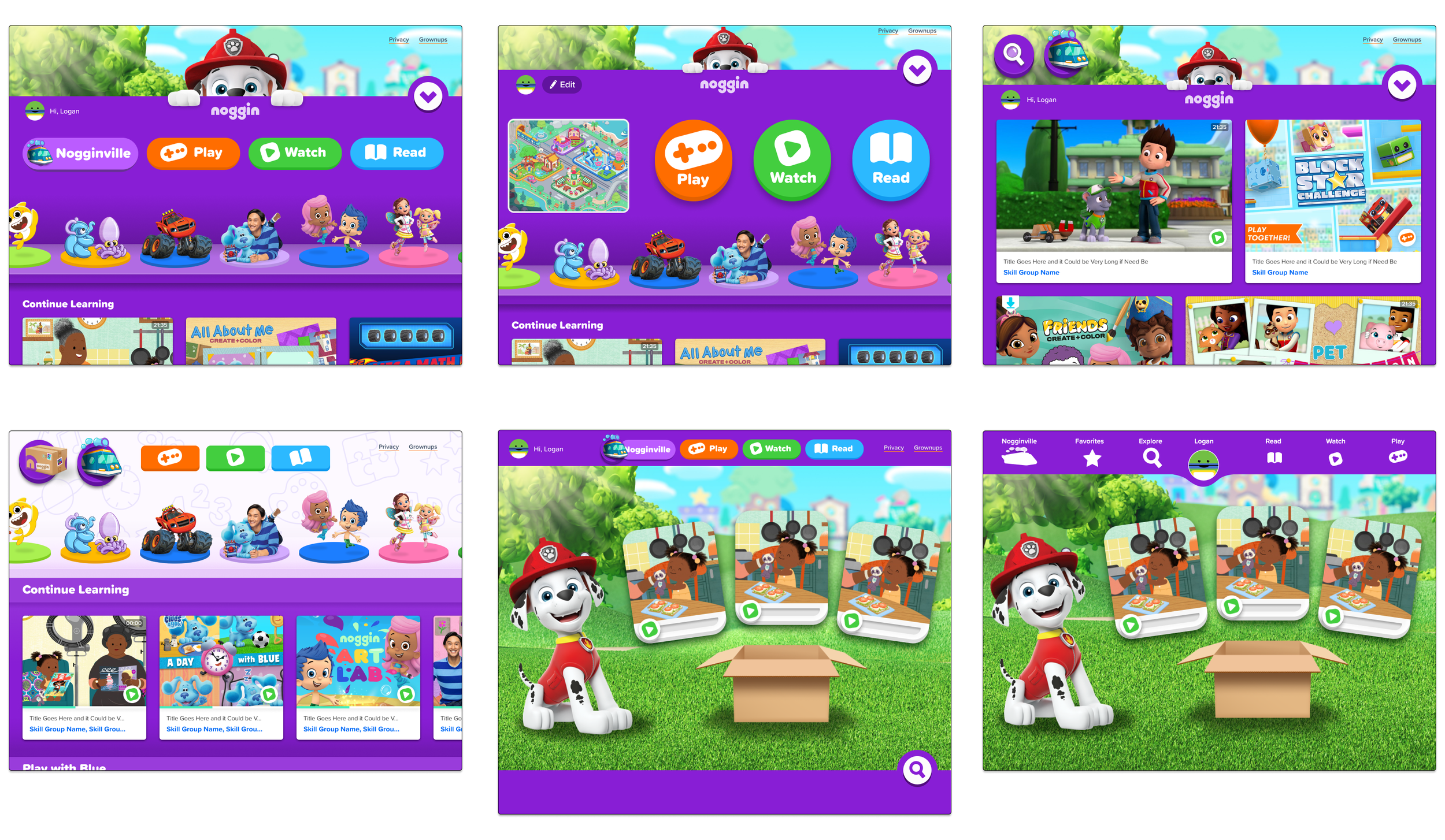
We played around with Lobby iterations. Some included layered content panel (top row) that the character could grab. Others included a navigation bar (bottom row) to reach the full library of content. Ultimately, we chose a design with the navigation bar to reduce complexity and competing elements on the page. Special Delivery was going to be the opening experience.
Special Delivery / Lobby iterations - Exploring navigation and button updates for the opening screen
Parent Dashboard Designs
For parents, we wanted to highlight the new progress their children have been making in the app. Previously, the parent dashboard was underutilized. We wanted it to become an easily accessible home base where they could see their child’s Engagement, Favorite Shows, and Visits to the app. Additionally, we wanted to make the Dashboard a place where resources such as printables and articles were available.
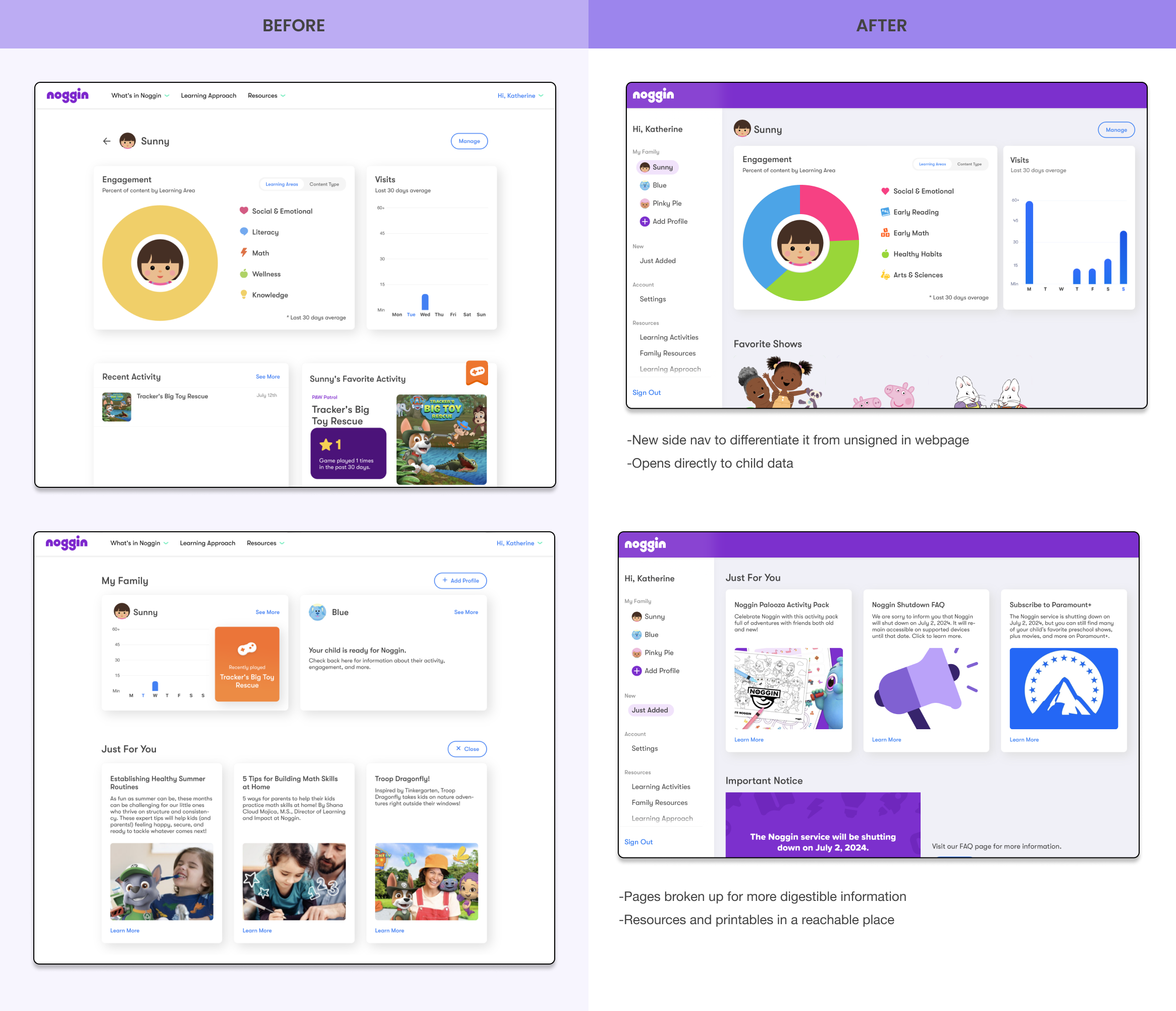
Previously, the old dashboard was confusing to parents because the navigation made it seem like they haven’t signed in at all. The top nav bar remained the same as the Noggin informational homepage before they signed in.
I worked to design a side nav that differentiated it from the homepage. I reprioritized sections, making sure that it opens directly to the child activity page, lessening the clicks it takes to navigate to child data and progress. I also grouped Resources together for parents to find Offline Activities, our new Learning Approach, and FAQ in the same section.
Final Design
Here are the some of the final designs that were handed off to engineers. We worked for weeks with the engineers to make sure the live, in app experience matched our Figma screens. I worked hard to communicate these changes during the debugging process, checking across apple iPad, kindle fire, and android tablet for inconsistencies.
Figma final designs
Live App Experience
User Testing and Next Steps
We did user testing through facilitator guided zoom app testing for children and used ustertesting.com for parent dashboard. The new parent dashboard was strongly preferred by parent user testers with a 72% approval rate among 66 testers. The Lobby update was well received amongst children. Further tracking and testing needs to be done to show the long term effects of Special Delivery to app retention and engagement.
Paramount decided to sunset the Noggin learning app as of July 2024.
Learnings and Takeaways
I'm proud to have worked on this project. After the company decided to shift the app in this more education focused direction, the Product team worked across teams to solidify the redesign of both App Lobby and Parent Dashboard.
It was always fun and engaging experience to sit in on user testing with kids (at times remote testing). I enjoyed the challenge of collaborating with an international engineering team, and owe that success to the teams fantastic PM and fellow designers.
More Projects
SOCIAL
CONTACT
imkqiu@gmail.com


