


Cycopay Onboarding
Created a more simplified, efficient, and inviting onboarding process for the SaaS platform. Focused on carrying users through from setting up their accounts to adding their first payment link. Increased comprehension of tested users by 61%.
Problem Space
What disrupts the onboarding process
for first time users of the platform?
CycoPay is a payment processing platform for business owners in the online ecommerce space in the EU.
The client’s user testing of the live beta version of the product, confirmed that first time users were running into difficulties with the onboarding process. Users reported it to be confusing and time consuming. Cycopay came to us for a redesign of the experience for first time users, from sign up to dashboard set up.
The team completed a heuristic evaluation of Cycopay desktop screens using Jakob Nielsen's 10 usability heuristics. We went through every screen, marked up and explained problem areas, and compiled it into a presentation for the client.
Competitive Analysis
What were other companies doing right?
I lead the competitive analysis of competing products Paddle, Razorpay, and Fastspring. We found it is important to show progress, reward success, and provide opportunities to recover from errors.

Insights
Users were hesitant to use the platform when the designs were unreliable.
Users were discouraged when they were unsure of responses to required fields in sign up
Users were hesitant to continue to sign up when the UI showed lack of consistency and hidden additional steps
Users were overwhelmed when sites had information overload and multiple CTA buttons
Iterations
Transaction History Card
Played around with the payee name, transaction #, invoice title, date and time. Highlighted Create Payment Link as a quick function button
Welcome Banner
Clear welcome and success messaging. One CTA, strong colors, increased scannability

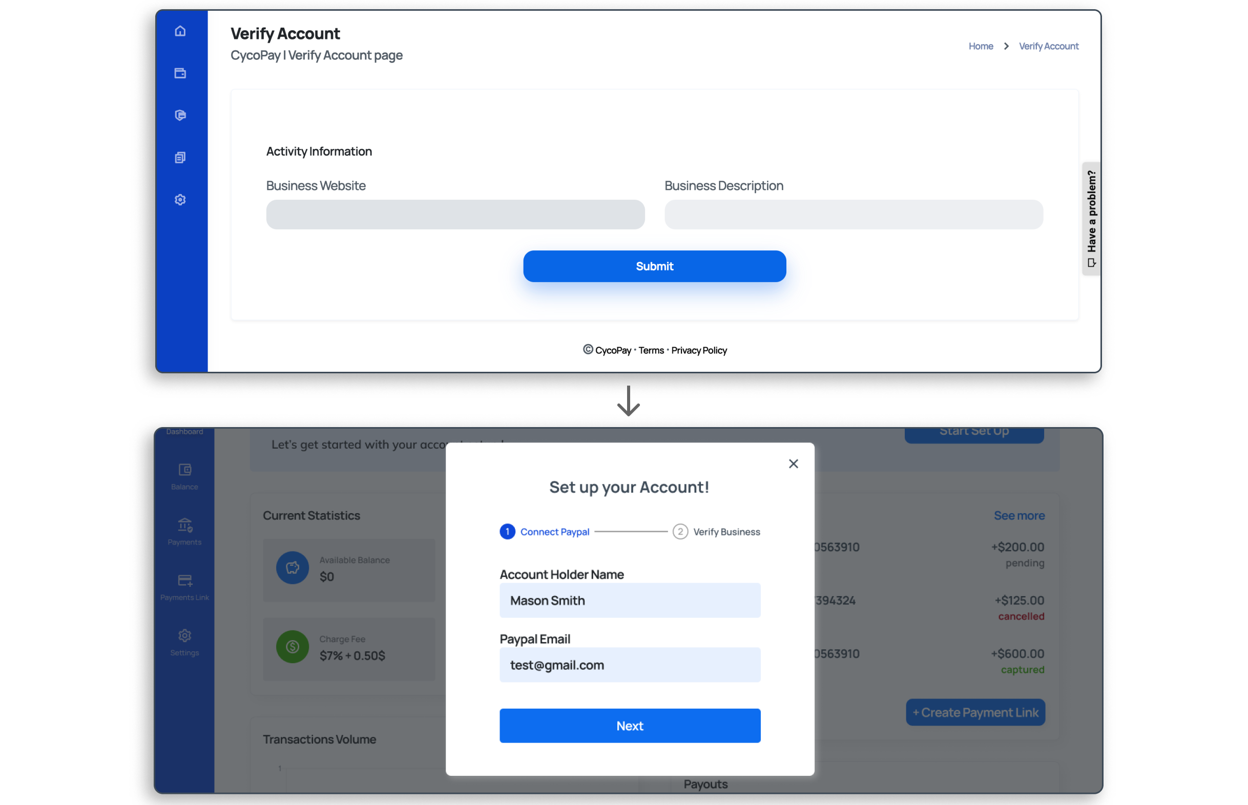
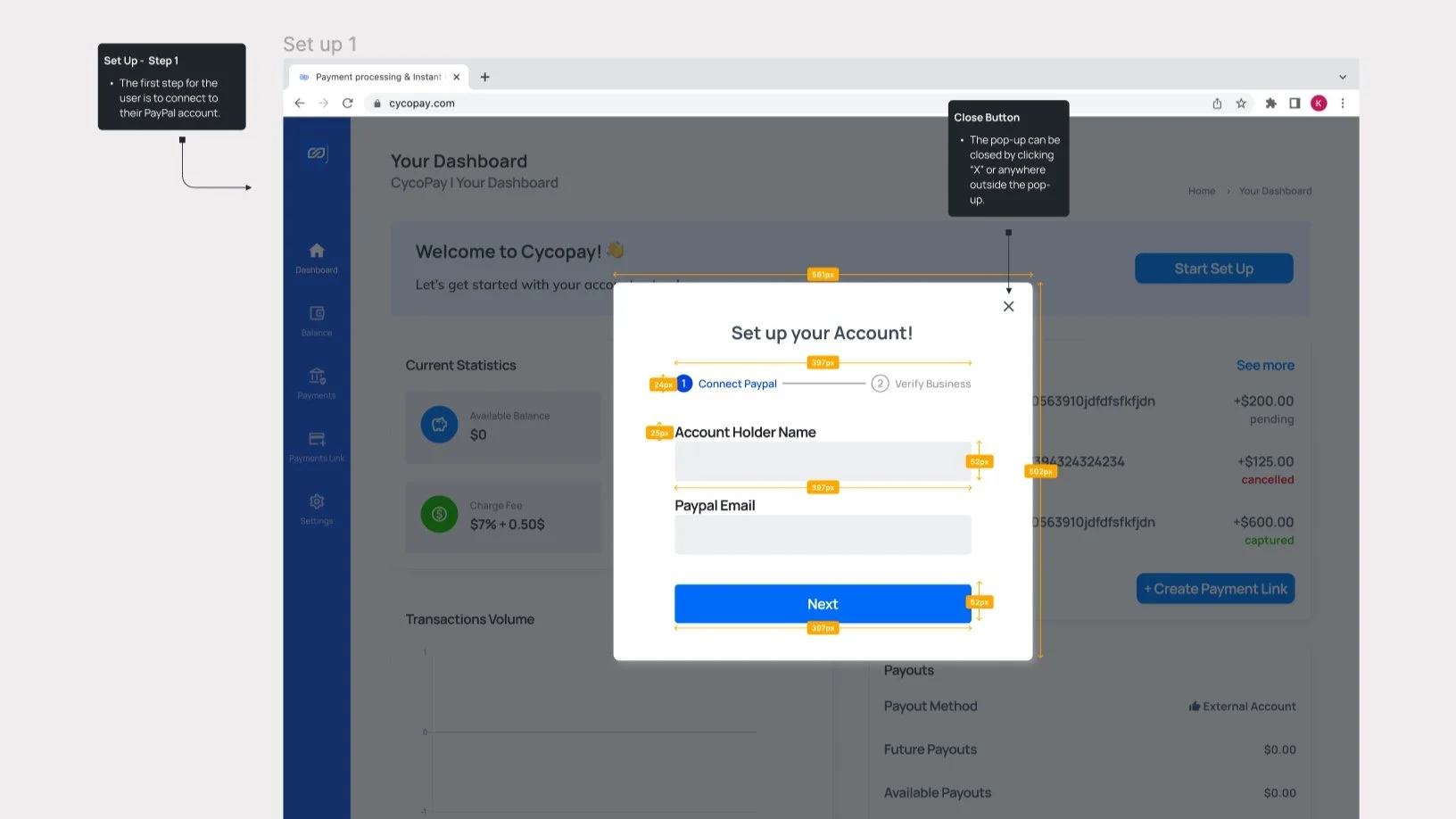
Popup onboarding
Popup to contextualize account set up with a progress bar and numbered steps.
Differentiated account types
Clearly separated individual and company accounts. Removed conditional forms.

Final Design
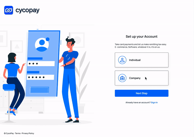
Clear sign up
Sign up is quick, without extraneous explanations. Clear separation between individual and company account.
Simple Account set up
Highlighted banner leads users to a popup. Finishing account set up results in a success message.

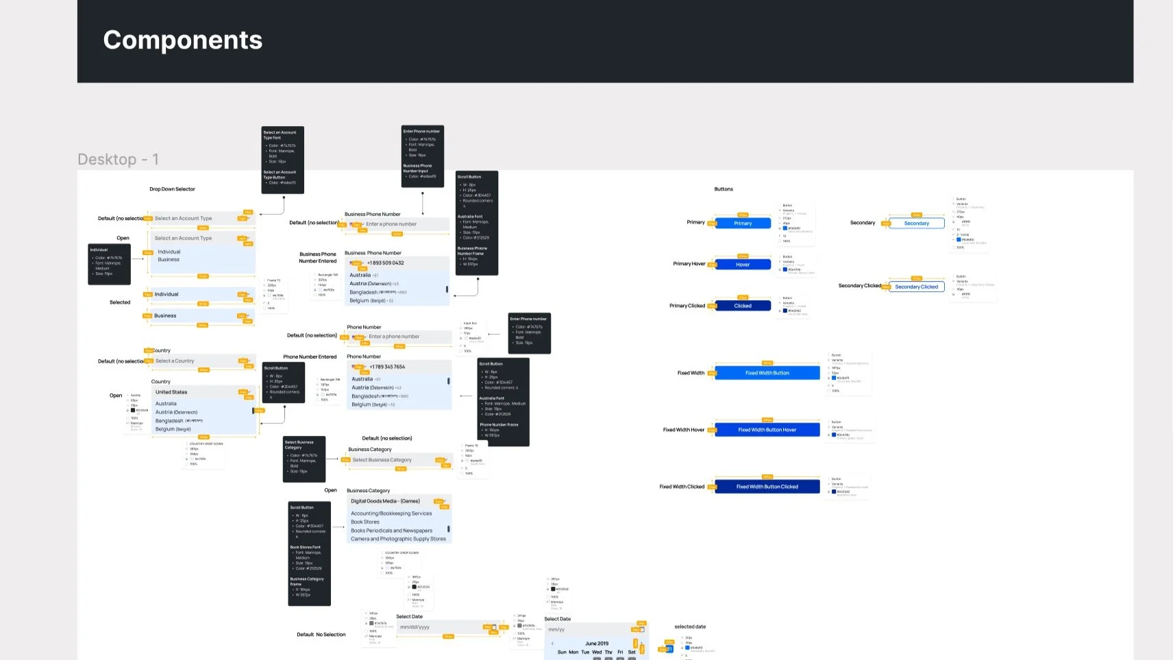
Dev Handoff
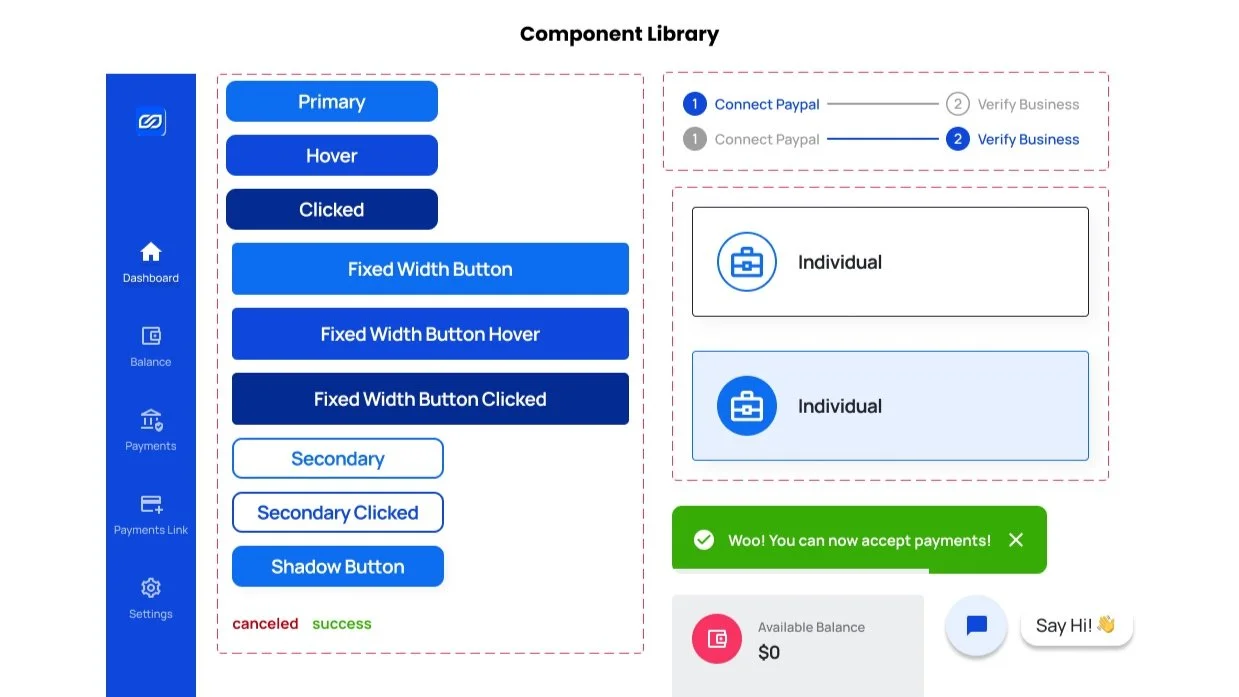
Style Guide


Next Steps
Test the prototype on real users
I would focus on measuring results quantitatively. Ideally the new design would show an increase in the number of users who perform the first action task from the dashboard immediately after creating an account. I would also measure the time spent for new users to finish setting up their account and creating their first payment link.
Expand onboarding
Some competitors included product tours in onboarding. If cycopay’s functionality gets more complex, a product tour might be necessary. In addition, I would look into the functionality of the chatbot and evaluate its responses specifically geared towards onboarding.
Learnings and Key Takeaways
International design is complex.
This was my first finTech startup client that is based in Europe, and it brought with it some interesting design concerns. From date and time displays, to currency and country selectors, I learned a lot about best practices for selectors, drop downs, and icons. Given more time it would be important to test the usability of the site with all different EU countries in mind and switch out English for other languages to see the text limitations of different components.
More Projects
Job Automation

CCWIP
Contact
imkqiu@gmail.com